Another single cover for Phoenix Rise. This time we're keeping the girl in a purple coat but putting her up against a "shadow monster thing". This one seems fairly open so there is lots of possibilities, especially as I have no clue what the beastie is going to look like.
The girl is hiding behind something (a wall or some wreckage) concealing the gleam of a katana (or whatever) from giving her away to her quarry.
Underwater? Yeah, that's would be an interesting thing to try and paint.
We've done a beast of the land, one of the water and now one of the sky. And look! Its that macaw again, though jumbo size!
The ones below are pretty self explanatory. A harsh white background, as if the land is smothered in a bright light, to contrast and emphasise the black/shadow thing. If not a bright white than a bright colour, like a mist/fog, like these two examples ( Example 1 Example 2).
Monday, 19 September 2011
Sunday, 18 September 2011
Torn
Here are the final coloured versions for Phoenix Rise's cover of the song Far From Home, cropped to his measurements. He chose the less saturated version for his final look.
For my first serious landscape I am very pleased. The clouds have a nice texture.
Wednesday, 14 September 2011
Torn (Part 2)
The sky has finally been added. I was fretting this part because clouds aren't my strong point, I'm always worried if they look natural and random enough. However, custom brushes helped a lot and I think it looks alright.
I had to temper myself from adding too many lightning bolts (I got a bit trigger happy *derpy grin*) and those tornadoes were a new thing for me.
The colour is going to be added next before finishing off anything that needs more attention (the city needs a bit more work). I will also chopped that radio tower's height, as originally it was going to be struck by lightning, but that screwed up the composition.
Monday, 12 September 2011
Torn ( Part 1)
Continued from the previous entry, a thumbnail was chosen, this is the bare-bones of the image. Thinking it best not to start with a blank flat canvas I hopped into ArtRage and played around with the paint tool before importing it into Photoshop and overlaying it with another stony/paint texture in my resource files (I've used it many times before and certainly a favourite).
Also, with this type of landscape, it seems best to be loose with the brushstrokes, to imply detail and to help prevent distracting over-detailing. The city-scapes in the graphic novel, Pride of Baghdad by Brian K.Vaughan, was a great inspiration (as it is about the true story of four lions escaping their zoo and into war torn Baghdad) along with Mike McCain's brilliant tutorial in ImagineFX magazine (issue 054, of his painting Ancient Crash Site)
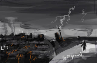
Starting in black and white, so that I can concentrate on forms and not worry about colour, I have just begun to build up some detail in the foreground, with the cracking road and the girl with some sort of parakeet on her arm (this might be changed later if it doesn't work). I have remained at 25% zoomed out, so that I have the whole image on my screen, to avoid the hazard of concentrating on one small section that'll, in the end, look out of place from the entire image. The blue box (below) is the proportions of the single cover, so I get the idea on what to focus on for the clients final version. This is can always be fiddled with as I go along.
Friday, 9 September 2011
Apocalypse (Thumbnail Sketches)
These are the thumbnails for a single cover for the same guy who asked for the Phoenix Rise Album cover. Only this time its an war torn almost apocalypse scene, which is something I have never done before. This should be very interesting, weather in a good way or not is yet to be seen, haha!
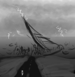
Above is a landscape that has been made barren with a town crumbling in the distance. The big 'thing' in the middle is some sort of great crash, it could be anything from a giant missile to an alien craft. The area is also dotted with craters and burnt objects like vegetation and wrecks of cars.
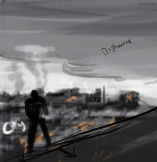
The figure appears to be walking away from a burning city, as if fleeing the destruction or just counting their lucky stars to still be alive.
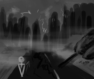
This one is focusing on being within the town cloaked in fog/smoke amongst wreckage and ruin. The road is cracked, the soil/earth has been turned up as if made into hasty barricades and there is a wreck of a tank to the right (I know it looks like a hot-dog with a pencil stuck in it, ha!)
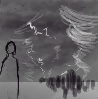
This is a little like the first thumbnail, only the person is close in the foreground and the force of nature is much more dominant.
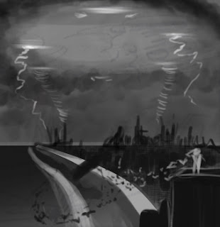
A person is standing on top of a building in a town that has been barricaded and left to it's fate by the UFO hovering above, shooting lightning and tornadoes from is belly. This is what you get when you watch War of the Worlds before planning things (damn you Spielberg!) There are also a flock of birds that are flying towards the giant object (mistake on my part, they should logically be flying away off screen)
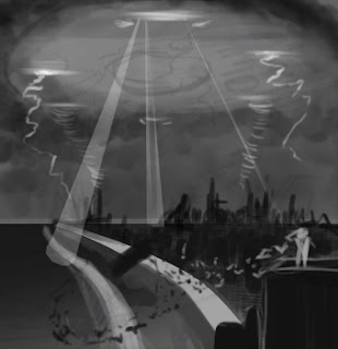
The same again but exploring the idea of spotlights from the UFO.
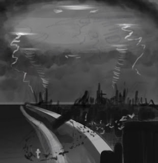
This time the person is dangerously venerable on the ground.
Like the one above, only with the UFO and with a denser city. All those below are exploring colour schemes, although that sort of thing is quite easy to change within a painting as I go along, thanks to Photoshop's tools.
Tuesday, 6 September 2011
Shaman (And a Marsupial)
( in your face he shouts ): SPIRITS!!!
( you wipe the spit from your eyes )
Crazy Shaman is crazy! This mental, arm thrashing, talking to the “spirits” in his head, kind of guy has a short role in the Primal game, but a memorable one. Such an odd character design too. Ugly, but in a funky way… wait! That was a compliment! Don’t hit me with your staff! It’s pointy!
Gonna take a break from the Primal stuff and do some other stuff for a bit. I might do this when I complete each world just so my brain doesn't melt.
I was going to do a creature design of a Kadabra, as if it was a real creature. However I noticed how much Fan-Art I have and got worried, so I scrapped that. Might come back to it some when. In the mean time here is the sketch of the male's profile (there was going to be a female one besides it) He's an odd/ugly mix, with a camel's snout and a fox-like body with goaty legs (but some odd feet).
Friday, 2 September 2011
Royal Bearded Hawk (Unfinished / Sketch)
Originally it was going to have a rather posh over-the-top tail flaring in the background, but I thought it made the bird too ridiculous which is why that bit hasn't been coloured.
This was a quick sketch that dragged on for more than it should have done. I began to obsesses with its body because it looked like it was in a "Flashheart" pose, according to outside criticism. Thought better than to dwell on this 'quick sketch' for too long. Who knows, I may spend more time on it at a later date.
But hey! This is still a rather good quick painting!
Subscribe to:
Posts (Atom)