Monday 29 November 2010

The Harpy Celaeno


Well, here it is. Towards the end I imported into Photoshop to use the Dodge tool on the metallic wings and to add a moonlight glow on the edges. Most importantly it got me into ArtRage, which I will defiantly be using in the future.

Tuesday 23 November 2010

The Harpy Celaeno: Part 4 (Starting to Render)

Have I said this before? ArtRage! I LOVE YOU!
I'm having so much fun doing the feathers with the brush tool. The Pencil tool was also used on the smaller parts and the hairs on the beard, it also worked well to add some texture to the skin.

The Harpy Celaeno: Part 3 (What Colour?)

Quickly I laid down some ideas for the colours and patterns. The first is a little bit like the colour palette of Celaeno from the animated film and I didn't like the cold palette. Because her name means "She who is Dark" I thought it would make more sense if her body was a dark maroon. The book also described her with bronze and/or gold plumage, weather in colour or texture (ie, actual metal) and these browns harmonise much better with a warm palette. I then had to think if I was going to add any patterns and markings. I'm still not sure, I may put some markings on her crest and maybe something on the tail, but I don't want to go over the top.


Sunday 21 November 2010

The Harpy Celaeno: Part 2 (Branches )

Using the stencil tool, I created my own by
finding a picture of a branch on the Internet and then editing it so its a solid black and white image. Problem with the stencil tool is that it's hard to control, you can't resize the stencil- you have to zoom in/out the image until it fits the stencil (as that remains the same size when its placed down - but changes with the image to zoom/rotation ect.) After laying three branches on separate layers I erased and added forks so the branches don't look the same before using the Palette Knife to fuzz the edges, making it look as if the paint is bleeding into a wet surface. Merging all these branches together into one layer I lowered the opacity down a bit.


The foreground branch needed to be more detailed and this time I needed to make a "Mask" out of a stencil so I could use long brush strokes and not worry about it "Going out the lines". Quickly hiding all the layers apart from the basic black painted base of the branch I create a file as before (solid black and white) and got it to the right size. The Brush tool is fluid to use, with the Auto-Clean off the colours react to each other as long strokes go over the surface.
However, it didn't look "woody" enough and a bit plastic. So I got some reference and used the Pencil tool to emphasise edges and groves. The Pencil also added some grainy texture.

This is all I'm going to do to the background at the moment. I'll come back to it as the painting progresses. However, before I even got started on the Harpy herself I needed to make yet another stencil/mask. This time, as the shape was complex, I opened Photoshop and used the mask tool and filled the area with black. It's now all ready for the Brushes to play!

The Harpy Celaeno: Part 1 (Blood Moon)

ArtRage, I LOVE YOU! You're so fun and textured! *rubs metaphorical skin of ArtRage*

Using Beagle's book as inspiration for the colour scheme I thought a warm palette, blood reds and bronze/golds.
"A bloodshot moon burst out of the clouds, and the unicorn saw her- swollen gold, her streaming hair kindling, the cold, slow wings shaking the cage. The harpy was laughing."

Seeing as the moon was bloodshot I thought I'd make the sky bloodshot too. I think I've been watching too much of the Batman and Hellsing Anime (as their sky's are red and it works well to set a horror theme to their settings.)
As ArtRage doesn't have a Mask tool, I was stumped on how to make a perfect circle for the moon. Using the brush was a no-no, as its set as an oval and would appear as a splat rather than a stamp (like in PhotoShop). Luckily I happened to remember playing with the Stencil tool (which can be seen at the bottom of the screen-cap to the right) and it had some circles there. Using photo reference I used the brush to blend in red,orange and reddish pink for the moon's colour then the Pen tool for the dark craters and finally some fine Pencil marks for the furrows and smaller marks. The end result was very pleasing, I think, and all done under 5min. I doubt it would have been that quick in PhotoShop.

Friday 19 November 2010

"A Corpse That Loves You..."


"That is a corpse that loves you and adores you and will never, never leave you ...Why did you want to see me?... When my own father never saw me and when my mother, as not to see me, made me a present of my first mask!"

Well, I had to get this done with. For something that was only an experiment it sure did drag out. In the end I cropped Christine out, she was annoying me, really annoying me. When I got the urge to do a Phantom of the Opera drawing in the first place it was going to be a solo portrait of Erik anyway. And like I said, this is really just an experiment with ArtRage, Gradiant/Mask shading and Lineart.

All I really did was apply some texture and noise and use the curves tool to adjust colour and contrast.

Friday 12 November 2010

Phantom and Christine: Part 5 (C's Hair and Rock Pillar)

Now that Erik has been fixed (not in the veterinary term, of course) Time to remove some line art or change it into a less obvious colour (like on the nose). Removing the line art worked best around the eyes, probably because the contrast was the best.


I wasn't sure how to do Christine's hair so I applied two gradient fills, a dark brown on Multiply filter and a warm orange on Screen filter. I then erased parts of the dark brown layer so only shadows remain and reveal the mid-tone again. The highlights was an outline done with the line-tool then filled in with the warm orange.

Now, its time that Christine stopped pawing the empty air. Looking on the Internet for cave walls I was drawn to the calcium formations that look both deformed and beautiful, suiting the theme of the story. Switching into ArtRage, which marvelously allows the layers to be kept, I built up the formation. It stills needs a bit of an adjustment so it isn't such a distraction and belongs within the setting.

Monday 8 November 2010

Phantom and Christine: Part 4 ( Erik Render)


I wanted to experiment with this picture and try shading using the gradient fill tool and using masks. However this didn't give the best results and some places where to small for this approach.


Above is Erik with shadow and light on him, then increased by duplicating the layers. I must remember this is quite a dark setting and as Erik is in the background he'll be darker (out of the lime light) than Christine, who is more of a focus point.
I also forgot to draw in Erik's cape, that's what those things are on his shoulders, silly me! That's probably why that arm looked a bit dodgy.

Sunday 7 November 2010

Red Bull ... gives you wings... O' No She Didn't!


...Oh yes I did!


Well, wouldn't ya know! I had some time to do another sketch. Here is the Red Bull, the last of the character designs I'm doing for Beagle's The Last Unicorn. He has a bison-like mane, cracked horns and hooves and a big ol' manhood! It may sound perverse, but when I was a kid playing with little plastic cattle it was the under-bits that told me what was a bull, so the impression has stuck with me... yep, when I think of bulls I think of the genitals before the horns (as females can have horns just as big) ... Okayyy! Focus off from the vulgar bits.
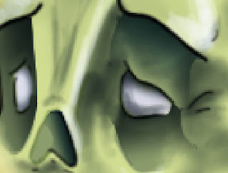
In the book the Red Bull was described as blind, and in the movie his eyes were white so I suppose that could be taken as blindness. I, on the other hand, thought no point in the eyes being there at all, so got rid of them completely and replaced with some weird horns. The Red Bull is kind of a ghost/phantom it doesn't matter if its unpractical. Besides, he has whiskers! Blind rats can get along almost as normal just by using their whiskers, sensing air vibrations ect, so why not a huge bull?
I also loved his long whippy tail from the film. So I kept that.

"Butterfly, do you know who I am?"


God, I love that quote from the book (may not be exactly how I wrote it...but hey, don't be picky!)


So, this is my take on the/a Unicorn from Beagle's book, the Last Unicorn. I tried to incorporate some unexpected animals with the design, like a rabbit nose ('coz they make rabbits look so damn cute ^.^) and even a Great Dane muzzle (though it just looked stupid so it was scaled down a lot). My unicorn is also a bit more fluffed in the body, like a mountain goat (I think the book did reference goats for the unicorn's description). For me the thicker pelt adds a bit of wildness and age, based off true wild horses before the taming by man made almost every horse smooth and shiny.

" There has never been a time without Unicorns, we live forever. We are as old as the sky, old as the moon..." ~ Quote from the movie adaptation.

Friday 5 November 2010

Phantom and Christine: Part 3 (Colour)


Time to start thinking about a palette. I want Christine and the Phantom to contrast in their colour tones, Christine being a warm reds and browns while Erik is cold greens and blues. 1. is the default palette and 2. is the same colours but having the background on a "Overlay" filter above it to get some darker hues.
Erik's arm (mainly the folds of the sleeve) is annoying me. It'll have to be fixed before I move on.

Tuesday 2 November 2010

Phantom and Christine: Part 2 (Sketch and Line art)

Well, here is the sketch. Erik's hand had to be adjusted so it was more long than bulky, as described in the book, but other than that its ready for going digital. I want to try and do the background in ArtRage (which I have wrongly been calling ArtRANGE *shrugs and laughs*)

Oh! And the Panda-Leopard has been scrapped. I simply don't have the room or time for traditional art/painting and when you don't enjoy the prospect of doing it then its not worth doing.

*Later* And there's the background. It's so weird that it was done digitally! You can see brush strokes for wombat-sake! It was imported into photoshop and adjusted slightly so the hue was more warm browns/golds instead of green and the edges darkened.
I've also just started the line art, above a mid tone flat colour layer so I can see what I'm doing better. I probably won't use most the lines, so I'll erase where necessary depending on how it eventually turns out at the end.