Saturday, 17 December 2011

The Helot and the Duke's Phantom


The Duke's Ghost is basically bitching about...well, everything... and good ol' Helot-guy has nothing better to do than sit an listen. (Get a job!)

I never knew what to make of this no-name Waith peasant despite him sacrificing himself to save his people he did try to kill you after you saved his life after all (not to mention both fighting against the same enemy)... he's a prick, in other words.
The Duke, whom we never see in the flesh (literally), peaks my curiosity more so. An aristocrat that showed kindness to the helot class, that enough is to set him apart. Its a shame we only got to see his ghost and bones, he would have been quite an interesting character, I imagine.

Empusa and Raum


VIDEO


I think Raum is more interested with how his 'tush' looks in an off-screen mirror than posing for a portrait.

My favourite couple! And what rich-basterds don't delve into acts of Vampirism... ... Raum should make a cameo appearance in Twilight, to show Edmund (or whatever his name is) how to be a good blood drinker.

Raum: "No! HBO's True Blood! Gore and Sex, wooo!"
Empusa: *slap*

.... annnyywaayy, a little off topic...

Empusa was a pain to do. I only just realised that she has swords (fricking swords!!!!) in her head-wear! Does she have shoes made out of axes as well?

Sunday, 11 December 2011

Elizabeth ... and Claude


Yep, more of those little Primal sketches.


Omg Claude! Run for your life!… literally! Hooray for Elizabeth. A typical modern girl, she likes dancing, dead pets and trying to get people to kill her parents… yeah! Such a normal little girl!Here, have a lolly-pop!


Wait! Why are there Rats in Aetha! Its a separate universe! Oh those crafty little buggers get everywhere, don’t they!

Video

Saturday, 10 December 2011

Melodies of Astral


Another CD cover for Phoenix Rise. Woo hoo!
This time it was something a little different.
I must admit I thought this would be quite a simple painting, no anatomy to get right, no landscape to think through... but that piano... *rolls eyes* My lord did that vex me for a while.

Monday, 5 December 2011

Art Prints Now Available


CLICK HERE

I've been pretty slack with uploading anything to the website after they so nicely mailed me saying they would like some of my work on their site. Manely because of money-based confusion and the website tools playing up on me. But I finally got some up there. They'll be more in the future, I imagine, but for there are six selected paintings that I deem good enough.

Sunday, 4 December 2011

Ninetails Approaches ( 1 hour painting)


I was feeling uninspired one night so I thought I'd do a quick painting using only one layer with a textured brush. I originally had in mind of a rat/snake thing in a cave (as you can see in this video) but as I was painting the coils I found they looked more like eight tails...so I added one more and -poof- Ninetails. No surprise as I was playing Okami and I had just defeated this boss on Oki Island. Third time playing that game, by the way, its that good! I wonder what the Nintendo DS sequal, Okamiden, is like?

Monday, 28 November 2011

A Werewolf's Fishing Trip


Lucky piranha’s don’t like the taste of supernatural flesh. This gang of nippers much prefer the fresh swamp fish he has caught. But luckily Aaron is up to the battle. Can you get more badass than punching a piranha in the belly? O! Watch out, Aaron! You might loose a bit more than your dinner if you are not careful *points to sneaky piranha between his legs.*


I wanted something different for this werewolf painting, to break a few clichés of snarling barbaric beasts, and brain stormed some rather domestic things for him to do. Then I watched one of those David Attenborough nature documentaries and the footage of baboons wading through water peaked my interest. After all, baboons look like a hybrid of man and beast, so I thought they’re awkward pose would look interested transferred onto a werewolf (who are often depicted as strong sturdy beasts). However, the first sketch I did didn’t work for me. It was pretty static and dull.
So I thought a story behind it might liven up the painting. Don’t ask how piranha’s got into it (haha) because I simply don’t know. It was an impulsive move. I think it was the red of their bellies that drew me to that idea, because it would contrast nicely with the dull de-saturated cold world of the swamp. They also provided a good comic relief tool, with their near cartoony expressions.


Special thanks to:
*The late Frank Frazetta and Lucas Graciano for inspiration on the pose. They taught me strong angles give a character more strength and aggressiveness.
* Andrea Brunner for her Bull Terrier portrait that helped me improve the anatomy of this guy’s face.
* Sebastien Larroude for his Green Swamp painting and James Gurney for his book “Colour and Light: A guide for the realist painter” that helped me figure out the lighting and colour in a foggy atmosphere, such as a swamp.

Monday, 14 November 2011

Sketch Dump and Fishing Werewolves

Below is a couple of sketches. Two are studies of fox heads and wading baboons, which inspired a fishing theme to a werewolf painting I'm doing next. At first I thought the awkward pose of a baboon would look good in a werewolf, as they share that human/beast similarity. However, in the end it looked a bit...well...shit. So I created a bit more of a story (a werewolf defending his line of caught fish from mobbing piranha - a sentence I thought I'd never say) that had a bit more movement and action to it.
At the bottom of all this is a creature head design made from mirroring a random shape in Photoshop. A very quick thing just to warm up. I like the technique though. I may do it more often, for a warm up.


Sunday, 6 November 2011

Adaro and Aino


Back to these little Primal drawings again. This is the king and queen of the realm Aquis, with one of your main enemies during this realm, the crab-like Glaaks. Aquis is a very lonely realm and Adaro and Aino are the only character you meet throughout the whole level (apart from that stupid Undine who was clever enough to hide in a pumping engine - was his name Artaro or something?) But he was such a minor character I'm not going to draw him, he looks almost identical in body shape to Aino anyway.

Monday, 31 October 2011

The Devil's Steed


VIDEO Part 1

VIDEO Part 2


A request from a watcher on DeviantArt who wanted me to paint my interpretation of Sol Invictus' album, The Devil's Steed. I must say I had a lot of fun with this. I was determined to use ArtRage again as I wanted to capture a traditional paint-feel and then I finished up/colour edited in Photoshop. Theodore Gericault's painting called "Officer of the Hussars" was also a big inspiration! The steed itself is mixture of horse and gharial, because I thought the horse on the Invictus' album looked a bit reptilian.

Below is the draft and the one nearer completion. As you can see the Devil had his horns clipped. They seemed too much of an eyesore.

Tuesday, 25 October 2011

Desert of Ga-Gorib


Here is the finished thing. Those colours are nice and baking hot! I can almost feel my skin getting sun burnt. There was going to be a flock of creatures as seen in the first draft, but in the end they didn't work so I removed them.

VIDEO:
Part 1 Part 2

Monday, 17 October 2011

Published in ImagineFX Magazine CD

I think this is the first time my work has been published publicly. So this is a great step forward in an art based career. At least I know I'm progressing.
If any of you guys are interested its the December 2011, Issue 76, of ImagineFX Magazine which goes on sale tomorrow ( 18th ) for those in the UK.

Pampered ego is pleased!

Tuesday, 11 October 2011

The Desert of Ga-Gorib (Part 2)


As predicted a creature with three forelegs is proving a problem. As I flip the canvas horizontally in Photoshop the problems that I couldn't see in my sketch became more obvious. So I those forelegs needed to be tweaked before I got into the detailing. The eyes were changed as well because before they looked too 'side-on' which is the structure of prey animals (predators have their eyes bang on the front of their face, a bit like humans). It also made it seem like the creature was looking in the direction of the girl, instead of the previous brainless expression from the sketch.


The skin will also have to look a bit more slimy, but for the moment I'm just sculpting the basic form.

All the images below show the process of the basic renders. The end is now in sight, I just have to go over with a second coat and tighten everything up.


Monday, 10 October 2011

The Desert of Ga-Gorib (Part 1)


Explanation of the title: based of the myth (or more specficically, the name) of Ga-Gorib from the Khoikhoi (a tribe of Africa). The name translates as 'the spotted one that is not a leopard'. Well, my shadow beast is supposed to be a cheetah, so it fits...kind of...

This was the first sketch, resembling the thumbnail more. However the beast look awkward and the scale just couldn't come through if it was crouched down like that.
So it became obvious that the beast needed to be standing upright at a distance. These are the basic sketches and plans. Phoenix Rise also wanted a few of my other creatures in there as well, but I had to be careful not to clutter and make the image too busy. So the creature list from my previous post is the 'Cheetah', two 'Rabbits', the 'Terrorsoar', a flock of 'Sharkers' in the background and a tentacle of a 'Octofelidae'. They have been scaled down so I can fit them all in one scene without making the Cheetah less impressive. They are accompanying the girl amongst the ruins, which are identified as the white splotches. The second image labels the cover measurements and the eye-path/composition.
One thing I am regretting is giving the 'Cheetah' a third foreleg. It looked good from a side view, but was tricky to draw front on. Trying to figure out the anatomy and where to place the thing was a nightmare. I may have to make it a bit more skinny, as its not a 'main' foreleg so wouldn't have to support as much as the creatures weight as the other two.

Wednesday, 5 October 2011

Shadow Creature Designs


Here are some shadow creature designs. I went slightly insane and tried to get a wide range of creature types and shapes. My personal favourite is the Cheetah design and I must admit I would hate to come across a levitating shark-thing in a dark alleyway.
And yes, there is a True Grit reference...not to mention a terribly bad pun.

Monday, 19 September 2011

Shadow Beast (Thumbnail Ideas)

Another single cover for Phoenix Rise. This time we're keeping the girl in a purple coat but putting her up against a "shadow monster thing". This one seems fairly open so there is lots of possibilities, especially as I have no clue what the beastie is going to look like.

The girl is hiding behind something (a wall or some wreckage) concealing the gleam of a katana (or whatever) from giving her away to her quarry.


Underwater? Yeah, that's would be an interesting thing to try and paint.


We've done a beast of the land, one of the water and now one of the sky. And look! Its that macaw again, though jumbo size!

The ones below are pretty self explanatory. A harsh white background, as if the land is smothered in a bright light, to contrast and emphasise the black/shadow thing. If not a bright white than a bright colour, like a mist/fog, like these two examples ( Example 1 Example 2).


Sunday, 18 September 2011

Torn


Here are the final coloured versions for Phoenix Rise's cover of the song Far From Home, cropped to his measurements. He chose the less saturated version for his final look.
For my first serious landscape I am very pleased. The clouds have a nice texture.


Wednesday, 14 September 2011

Torn (Part 2)


The sky has finally been added. I was fretting this part because clouds aren't my strong point, I'm always worried if they look natural and random enough. However, custom brushes helped a lot and I think it looks alright.
I had to temper myself from adding too many lightning bolts (I got a bit trigger happy *derpy grin*) and those tornadoes were a new thing for me.
The colour is going to be added next before finishing off anything that needs more attention (the city needs a bit more work). I will also chopped that radio tower's height, as originally it was going to be struck by lightning, but that screwed up the composition.

Monday, 12 September 2011

Torn ( Part 1)

Continued from the previous entry, a thumbnail was chosen, this is the bare-bones of the image. Thinking it best not to start with a blank flat canvas I hopped into ArtRage and played around with the paint tool before importing it into Photoshop and overlaying it with another stony/paint texture in my resource files (I've used it many times before and certainly a favourite).

Also, with this type of landscape, it seems best to be loose with the brushstrokes, to imply detail and to help prevent distracting over-detailing. The city-scapes in the graphic novel, Pride of Baghdad by Brian K.Vaughan, was a great inspiration (as it is about the true story of four lions escaping their zoo and into war torn Baghdad) along with Mike McCain's brilliant tutorial in ImagineFX magazine (issue 054, of his painting Ancient Crash Site)


Starting in black and white, so that I can concentrate on forms and not worry about colour, I have just begun to build up some detail in the foreground, with the cracking road and the girl with some sort of parakeet on her arm (this might be changed later if it doesn't work). I have remained at 25% zoomed out, so that I have the whole image on my screen, to avoid the hazard of concentrating on one small section that'll, in the end, look out of place from the entire image. The blue box (below) is the proportions of the single cover, so I get the idea on what to focus on for the clients final version. This is can always be fiddled with as I go along.

Friday, 9 September 2011

Apocalypse (Thumbnail Sketches)

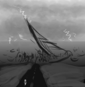
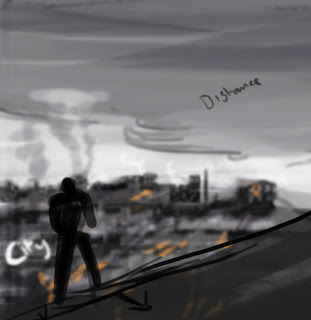
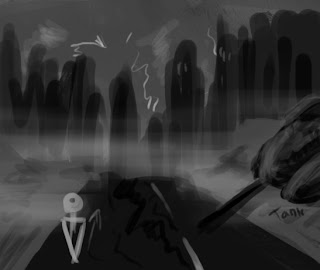
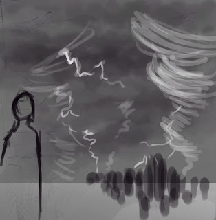
These are the thumbnails for a single cover for the same guy who asked for the Phoenix Rise Album cover. Only this time its an war torn almost apocalypse scene, which is something I have never done before. This should be very interesting, weather in a good way or not is yet to be seen, haha!


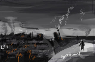
Above is a landscape that has been made barren with a town crumbling in the distance. The big 'thing' in the middle is some sort of great crash, it could be anything from a giant missile to an alien craft. The area is also dotted with craters and burnt objects like vegetation and wrecks of cars.


The figure appears to be walking away from a burning city, as if fleeing the destruction or just counting their lucky stars to still be alive.


This one is focusing on being within the town cloaked in fog/smoke amongst wreckage and ruin. The road is cracked, the soil/earth has been turned up as if made into hasty barricades and there is a wreck of a tank to the right (I know it looks like a hot-dog with a pencil stuck in it, ha!)


This is a little like the first thumbnail, only the person is close in the foreground and the force of nature is much more dominant.

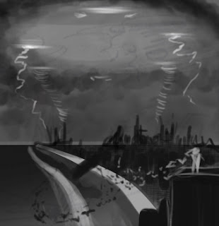
A person is standing on top of a building in a town that has been barricaded and left to it's fate by the UFO hovering above, shooting lightning and tornadoes from is belly. This is what you get when you watch War of the Worlds before planning things (damn you Spielberg!) There are also a flock of birds that are flying towards the giant object (mistake on my part, they should logically be flying away off screen)

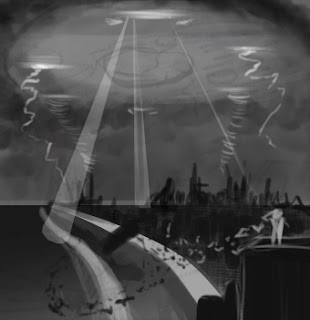
The same again but exploring the idea of spotlights from the UFO.


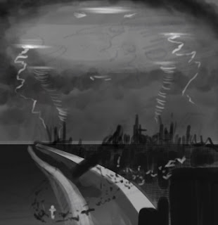
This time the person is dangerously venerable on the ground.


Like the one above, only with the UFO and with a denser city. All those below are exploring colour schemes, although that sort of thing is quite easy to change within a painting as I go along, thanks to Photoshop's tools.