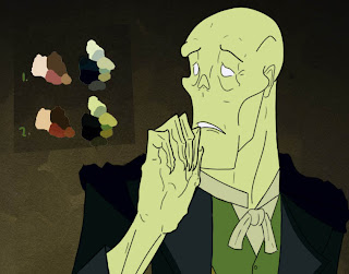
Time to start thinking about a palette. I want Christine and the Phantom to contrast in their colour tones, Christine being a warm reds and browns while Erik is cold greens and blues. 1. is the default palette and 2. is the same colours but having the background on a "Overlay" filter above it to get some darker hues.
Erik's arm (mainly the folds of the sleeve) is annoying me. It'll have to be fixed before I move on.

No comments:
Post a Comment