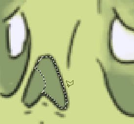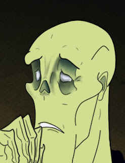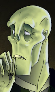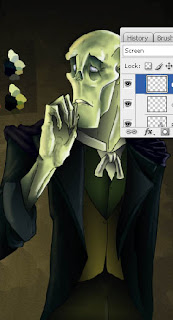

I wanted to experiment with this picture and try shading using the gradient fill tool and using masks. However this didn't give the best results and some places where to small for this approach.


Above is Erik with shadow and light on him, then increased by duplicating the layers. I must remember this is quite a dark setting and as Erik is in the background he'll be darker (out of the lime light) than Christine, who is more of a focus point.
I also forgot to draw in Erik's cape, that's what those things are on his shoulders, silly me! That's probably why that arm looked a bit dodgy.

No comments:
Post a Comment